Dagger
Crafting a beer brand
Let’s be honest, ordering a light beer isn’t the easiest (coolest) thing to do at a bar. There’s this weird stigma, sometimes brought on by that know-it-all “friend” who thinks anything under 5% is for the fishes (his name’s probably Trent), and that light beer can’t hang with craft. And while that may have been true in the past, we’re living in the future.
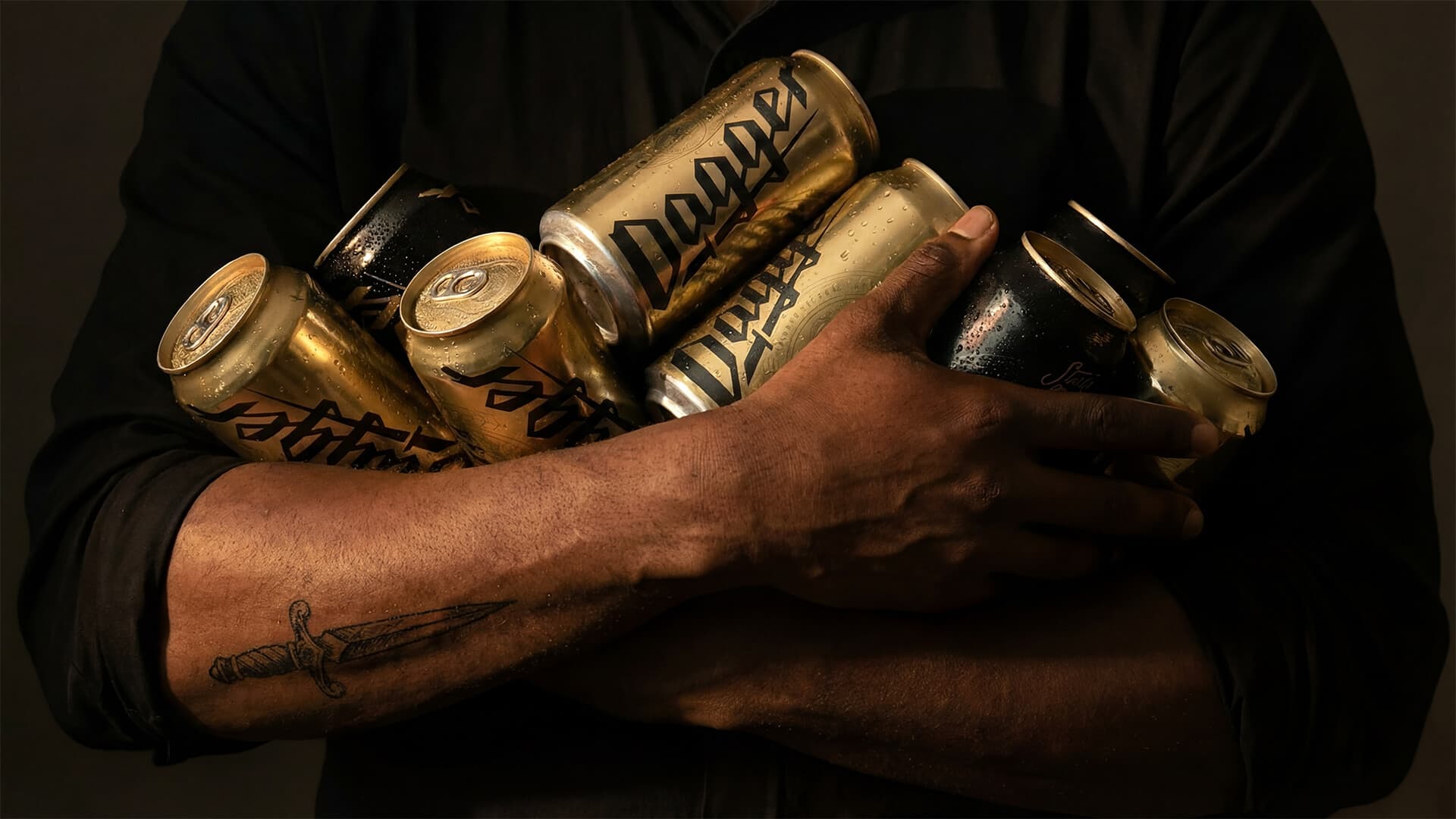
Introducing Dagger, the anti-craft craft beer from our friends at Monarch & Misfits (La Carnita, Sweet Jesus etc…). Dagger is light, it’s crisp, and in our opinion, it’s damn good. They crafted it with a top local Brewmaster to give it a high flavour but low percentage so you could not only taste Dagger, but more importantly, so you could crush it.
While they locked down the sip, we locked down the style.
We knew that once people tried Dagger they’d be down so the challenge was creating a can that fit within the La Carnita + Home of The Brave aesthetic and, first and foremost, made people want to put it in their hand. We wanted Dagger’s look to stand out against the mundane big box breweries while avoiding the cluttered art-fest of most craft beer labels.
What we ended up with is a design that reflects Dagger itself: simple, clean, and bold. It stands out against other beers on the self and most importantly, it stands up to quality and taste of craft. Suck it, Trent.
Project Stats
Original logo options
Breweries visited for inspiration
Trent jokes in the write up
